BOOKS - Responsive Web Design with HTML5 and CSS: Develop Future-Proof Responsive Web...


US $7.51

984787

984787
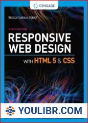
Responsive Web Design with HTML5 and CSS: Develop Future-Proof Responsive Websites Using the Latest HTML5 and CSS Techniques
Author: Ben Frain
Year: January 1, 2015
Format: PDF
File size: PDF 23 MB
Language: English
Year: January 1, 2015
Format: PDF
File size: PDF 23 MB
Language: English
About This BookLearn and explore how to harness the latest features of HTML5 in the context of responsive web designLearn to wield the new Flexbox layout mechanism, code responsive images, and understand how to implement SVGs in a responsive projectMake your pages interactive by using CSS animations, transformations, and transitionsWho This Book Is ForAre you writing two websites: one for mobile and one for larger displays? Or perhaps you've already implemented your first RWD but are struggling to bring it all together? If so, this book gives you everything you need to take your websites to the next level.Some HTML and CSS knowledge will help; everything else you need is included in the book.What You Will LearnUnderstand what responsive design is, and why it's vital for modern web developmentLearn to write cleaner, faster, and more semantically-rich HTML5 markup and understand all the new key elementsHow to use CSS3 media queries to apply different styles to different device capabilities and understand evolving media queries coming in CSS4Learn how to load different images depending upon screen size, device resolution or contextConquer forms! Add validation and useful interface elements such as date pickers and range sliders with HTML5 markup aloneImplement SVGs into your responsive designs to provide resolution-independent images, and learn how to adapt and animate themLearn how to use the latest features of CSS including Flexbox, custom fonts, nth-child selectors, CSS custom properties (variables), and CSS calcIn DetailThe changing way in which we access the Web means that there has never been a greater range of screen sizes and user experiences to consider. Web pages built to be responsive can adapt their content for not just today's devices but tomorrow's too.Learn how to build websites with a and "responsive and mobile first and " methodology, allowing it to display effortlessly on every device that accesses it. Packed with examples, and a thorough explanation of modern techniques and syntax, this book provides a comprehensive resource for all things and "responsive and ".The second edition covers all the most up-to-date techniques and tools needed to build great responsive designs, ensuring that your projects are future-proof.


